Any eCommerce business that wants to drive higher sales and enjoy a more extensive base of repeat customers must deliver an incredible user experience (UX) on-site. Whenever potential customers land on a storefront, their first interaction is with the frontend.
Obviously, online printers must invest in impeccable UX design on priority to make it easier for their end customers to interact with the brand smoothly. Research shows that 88% of consumers do not revisit a site if it has a bad user experience.
Naturally, when our clients adopted our All-In-One Web2Print (AIOW2P) software solution, they wanted to manage the frontend on their own — change the colors or layout, fonts used, navigation placement, and so on. Design’N’Buy’s support team would step in and help them
Enhanced UX is a necessity
But we knew that our printing clients wanted and deserved more flexibility in terms of how their frontend looked like. Using third-party plugins to satisfy their branding requirements was also not viable or possible every time. Setting up the storefront as desired was a real struggle.
As per our internal research, 80% of a web-to-print company’s sales come from file uploads or direct uploads. Only 20% of the business came from the Design Studio.
We wanted to change that. After many brainstorming sessions, we added many new functionalities to the latest version of our online design software, i.e., AIOW2P 4.0. In the previous blog, we learned about the technological upgrades in the online web-to-print editor.
The second part of the series focuses on the enhanced UX capabilities that AIOW2P 4.0 offers. Come, let us check them all out:
Highlights of features made to enhance user experience on your print store :
1. Welcome DesignNBuy’s theme known as Saral
We previously used a Webpixels theme which, as previously mentioned, posed many challenges when it came to personalizing and testing it. AIOW2P 4.0 does not rely on any third-party theme and instead gives us a fantastic opportunity to introduce our custom theme called Saral.
It comes with print industry-specific features most used by printing companies. Now businesses would have full ownership of the frontend. Saral’s layout is very clean, and every section is configurable from the backend, which is the whole point of having our theme.
Some of the homepage features include information blocks for categories, a blog section, testimonials, and a newsletter subscription banner. We want our customers to enjoy end-to-end flexibility. The Saral theme is only available on our online print shop software.
2. Enjoy page load speed between 1.0 to 1.5 seconds
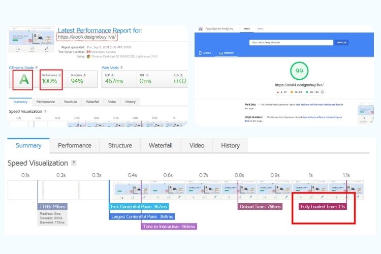
In this day and age, fast page loading is a must if you want to engage your customers online. And there is nothing faster (or better) than our theme.
Our Google PageSpeed is 98, and GTmetrix score is 100. Plus, our solution has a mobile speed score of more than 60. We guarantee that there is no other web-to-print storefront matching these performance criteria.
3. Benefit from high-end navigation functionalities
Besides adding left and top navigation options, we have given advanced search filters. For instance, if a printer sells 2000+ business card templates, customers can efficiently run a text-based search using long-tail keywords to browse through options that interest them.
4. Build an SEO-friendly storefront
The content sprinkled through the storefront can be edited from the backend. That means you can use major keywords across the website and boost your chances of ranking your web-to-print storefront higher in Google search engines.
For instance, add main keywords in the description of the hero banner on the homepage, category pages, and individual pages. Besides, every individual product page has an FAQs section at the bottom, wherein one can answer the most frequently asked questions on Google.
5. Modernize your product pages hassle-free
The previous versions of AIOW2P gave the printers two layout options for product pages, which was somewhat confusing. We have cut the clutter in AIOW2P 4.0 and designed a clean, crisp, and user-friendly layout.
As you can see below, we have given “Add To Wish List” and “Write A Review” options at the top. To make placing an order hassle-free, we have tried to be as thorough as possible for every product category, especially in the Quick Edit feature.
For instance, we have covered a plethora of options for easy personalization — quantity, paper type, printed side, corner type, lamination, design support expenses, and so on. To help your end customers arrive at a quote, a section for shipping rate estimation is given separately.
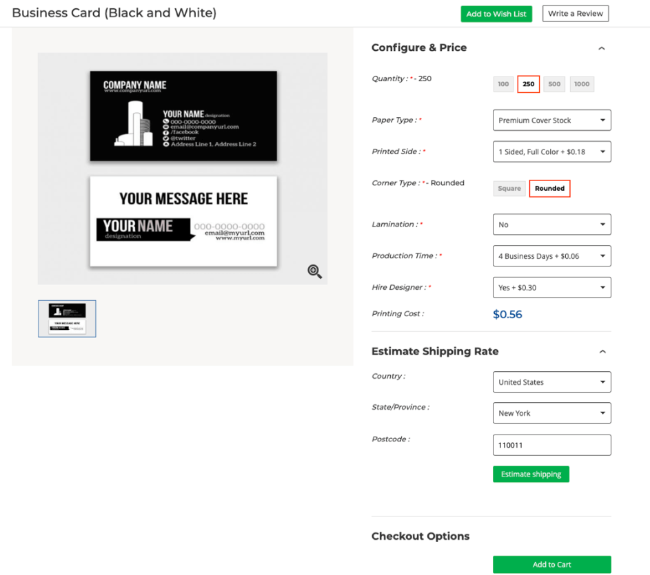

The previous versions, the following points — printed side and corner type — did not support the Quick Edit feature, and custom settings had to be used for ensuring them.
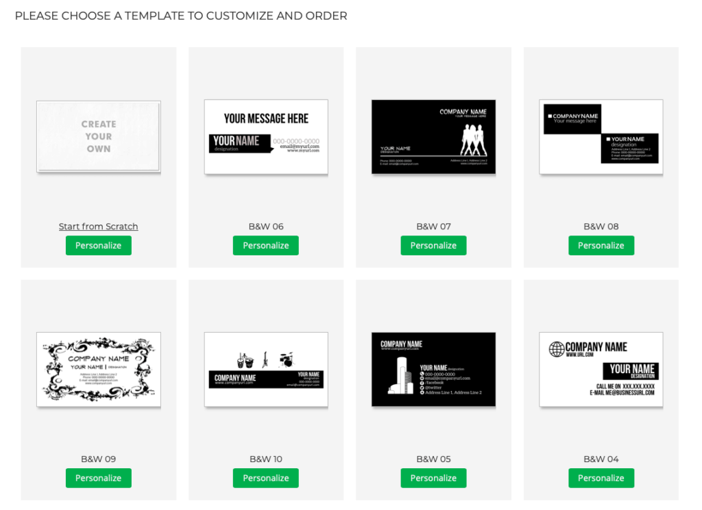
In addition, if a printer has limited templates for business cards, all of them can be neatly presented on the same page itself. There is no need to redirect the user to a different page to view the whole range of templates on the web-to-print designer.
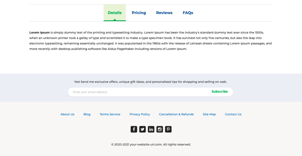
At the bottom of every product page is a panel comprising Product Details, Pricing, Reviews, and FAQs. The printer can add or delete sections on this panel as per usability or requirements.
In a nutshell, AIOW2P 4.0 gives dedicated blocks for clearly representing all the information about a specific product.
6. Make checkout a breeze
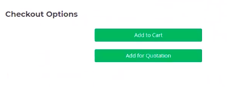
The checkout options are also clear and wholesome, giving end-customers more freedom to manage their order or quotations how they like. In AIOW2P 4.0, the focus is more on initiating action from end-users through action-oriented buttons.
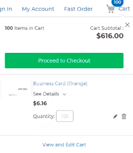
Then, there is a mini cart feature that gives customers an overview of their cart.
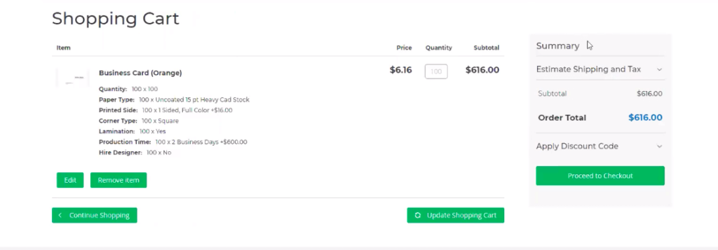
And when they go to the cart, they can see clear-cut descriptions of what they will place an order on. This level of transparency is a fresh addition to AIOW2P 4.0.
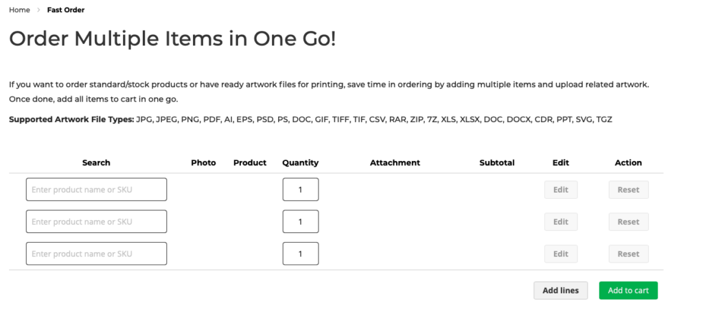
Plus, if your customers want to order standard/stock products or already have artwork files for printing, they can save time by uploading related artwork and multiple items to the cart.
7. Hyper-personalize your frontend from the dashboard
All aspects of the Saral theme can be managed from the backend. For instance, the “color pallet management” button allows you to make color variations as per the brand, product category, and so on.
One can create pallets for each group and personalize them as desired on the web-to-print storefront solution. This is especially helpful when printers are running multiple stores.
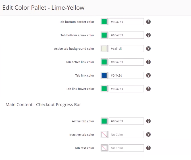
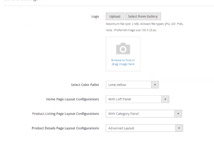
Having said that, they can give every storefront a different UI/UX by taking care of small details such as homepage layout, product listing, product page design, corporate logo, and more.
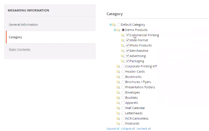
AIOW2P 4.0 also enables the printers to change the menu format (vertical or horizontal) and select the number of categories and products they want to show in the menu through the Mega Menu Information tab.
Over to you
We can proudly say we have taken care of every little aspect of frontend management. Whether a printer has one storefront or multiple, limited product categories or 100s, setting up a storefront with a tremendous look n’ feel would not be a hassle with AIOW2P 4.0.
If you would like to know more about the enhanced UX features in the new version of AIOW2P, please drop us a line at Here

