In today’s digital landscape, a compelling homepage design serves as the virtual gateway to an artistic haven, where creativity meets convenience. With modern e-commerce at its peak in a digitalised world, underestimating the significance of adhering to print website homepage design best practices can have dire consequences for your business.
The homepage serves as the digital storefront, the first encounter that potential customers have with the brand and offerings. Ignoring these established practices risks alienating visitors and driving them away before they even have a chance to engage with your products.
From seamless navigation to compelling visuals and clear messaging, these practices are meticulously designed to create a cohesive and welcoming experience that instils trust and guides visitors toward making purchases. Neglecting them can result in lost customers, missed opportunities, and a diminished online presence.
Are you looking at homepage design options and unsure of which direction to go in, here are a few questions to help guide your decision:
- What action do you intend for visitors to take? (e.g., make a purchase, subscribe to your email list)
- How user-friendly the process you want it to be for them?
- How many steps are there to complete your goal?
- What amount of information is necessary for them to move to the next step?
- Are there any stages that could be removed to streamline the process?
Your print buyers sometimes land on homepages knowing what they want, and other times they don’t. You have to design your homepage with both in mind while ensuring that your decisions align with your primary goals.
Allow customers to personalize your products with ease
Web to print software lets businesses create online stores where customers design and order custom prints, like brochures or t-shirts. It boosts sales, saves time, and keeps customers happy.
Conversion-Boosting Tips for Creating Your Print Business Website Homepage
Creating a web to print website homepage that effectively boosts conversions requires a combination of strategic design, compelling content, and user-friendly features. This guide is a compass, leading through the intricate process of crafting an engaging and user-centric homepage that not only showcases the masterpieces but also beckons visitors to explore the rich tapestry of the print offerings.
From igniting inspiration to fostering trust, let us unravel the essential elements and strategic insights that will transform casual browsers into avid patrons.
Take a look at our top 16 effective tips to help you optimize your web to print website and achieve homepage success.
#1: Clear Branding
Display your store’s logo, store name, and tagline prominently at the top of the page to establish your brand identity.
#2: High-Quality Imagery
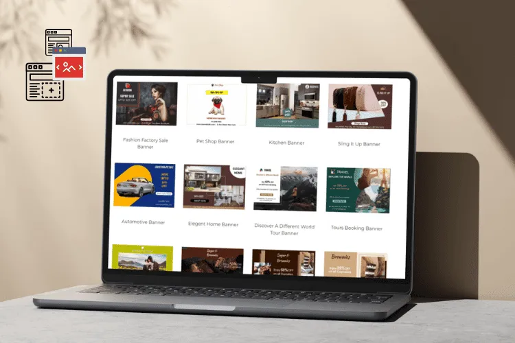
Use visually appealing, high-resolution images that showcase your best print products. High-quality visuals help visitors visualize the product’s details, colors, and overall quality.
#3: Prominent Search Bar
Place a visible search bar at the top of the page to help customers quickly find specific print categories or themes.
#4: Featured Products
Highlight a selection of your top prints or new arrivals to capture visitors’ attention and encourage exploration.
#5: Clear and Compelling Value Proposition
Communicate the unique value your print business offers. Highlight what sets you apart from competitors and why visitors should choose your products. Use concise, persuasive headlines and subheadings to convey your message quickly.
#6: Product Categories
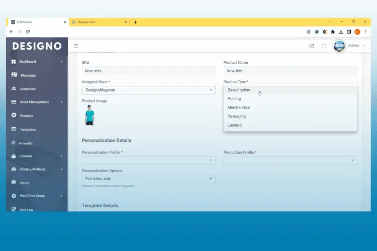
Organize prints into clear and easily accessible categories (e.g., landscapes, abstract, animals) with thumbnail images for each category.
#7: Call-to-Action (CTA) Buttons
Include eye-catching CTAs like “Shop Now,” “Explore Prints,” or “View Collection” to guide visitors toward browsing your products.
#8: Customer Testimonials
Display authentic customer reviews and testimonials to build trust and credibility among potential buyers.
#9: Special Offers and Discounts
Showcase ongoing sales or special promotions prominently on the homepage to entice visitors.
#10: Personalization Options
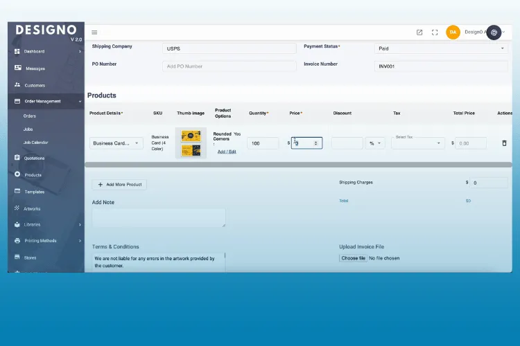
Highlight any customization or personalization services you offer, showcasing examples to inspire visitors.
#11: Contact Information
Provide clear contact details, including an email address, phone number, and links to your social media profiles for customer inquiries.
#12: Newsletter Signup
Include an option for visitors to subscribe to your newsletter to receive updates, promotions, and exclusive offers.
#13: Trust Signals
Display trust badges, claims, security icons, and accepted payment methods to assure customers of the safety of their transactions.
#14: Social Media Integration
Feature links to your social media accounts and possibly integrate an Instagram feed displaying your prints in real-life settings.
#15: Live Chat or Customer Support
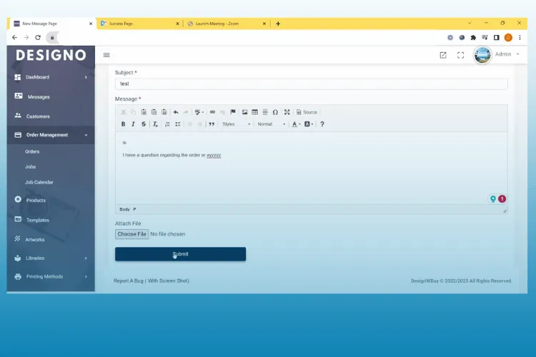
Implement a live chat feature or provide contact information for customer support to assist visitors in real-time.
#16: Footer
Place essential links, such as privacy policy, FAQs, shipping & returns policy, terms of use, and additional contact information, in the footer for easy access.
By incorporating these essentials, you can create a homepage that effectively showcases your print store’s unique offerings, engages visitors, and encourages them to explore your products and make purchases.
Start Free Trail
With DesignNBuy, your customers can easily personalize a wide range of products, creating a truly unique and personalized shopping experience. This not only increases customer engagement, but also helps to build customer loyalty.
7 Advantages of Having a Well Designed Printing Website for Your Online Printing Business
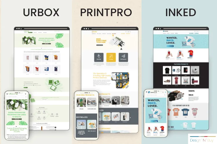
A well-crafted homepage design can offer a multitude of benefits to your online business or marketing campaign by increasing conversions, enhancing user experience, and providing a focused platform for your messaging. It’s a powerful tool for achieving specific goals and driving results. Some of its notable advantages are-
1. Stronger Branding
2. Increased Conversion Rates
A targeted landing page is designed to match the specific interests of your audience, leading to higher conversion rates. By focusing on a single call-to-action (CTA), you can guide visitors toward the desired action, whether it’s making a purchase, signing up for a newsletter, or filling out a form.
3. Clear Communication
4. Improved User Experience
5. Better Audience Targeting
6. Enhanced Tracking and Analytics
7. Reduced Bounce Rates
7. Lead Generation and Data Collection

With Design’N’Buy, you can:
√ Streamline your business processes
√ Increase productivity and reduce mistakes
√ Manage artworks and mockup files
√ Streamline customer service and communication
Summary: Follow the Advice Above to Create the Best Print Website Homepage
In the ever-evolving digital landscape, the journey towards a successful web to print website homepage is not a destination but a dynamic process. Encouraging continuous improvement and embracing experimentation is the key to achieving and maintaining optimal results.
As technology advances and user preferences shift, staying stagnant is a risk no brand can afford. By fostering a culture of constant refinement, you open the door to innovation, insight, and adaptation.
Regularly analyze user behavior, gather feedback, and fearlessly experiment with new ideas. With each iteration, one enhances user engagement, conversion rates, and overall satisfaction.
Remember, the homepage is a canvas that evolves alongside your audience’s needs and desires. By committing to continuous improvement, it is ensured that the online presence remains vibrant, relevant, and poised to deliver the best possible results.
If you’re looking for a web to print software partner, don’t hesitate to reach out to our team of web-to-print experts at DesignNBuy. Feel free to send us an email, and we’ll be happy to engage in a constructive conversation to address any challenges you may have.
View the video for a more comprehensive understanding of Best Storefront Theme for Printing Store 2025
Check out some of our other great content here
All-in-One Web2Print 5.0: Tailored for Corporate Printers & B2B Portals…Read More
Overcoming Corporate Printing and Corporate Branding Challenges with Web to Print Solutions…Read More
Corporate Printing Efficiency: Assessing Simple Form-Based Design Tools and Canva-Like Design Tools…Read More
21 Print Finishing Techniques & Effects for Your Printing and Packaging Business…Read More
*This Post has been Updated on January 2025.

